Action Buttons
Action Button widgets let DashForge trigger game or tool actions while you drive.
Typical uses:
- pit limiter
- headlights
- wipers
- camera changes
- replay controls
- stream markers
- custom keyboard shortcuts
Requirements
For Windows game control, run DashForge Bridge and enable its command listener.
Default command port:
8765
Telemetry and commands use different ports. Do not send Bridge commands to the UDP telemetry port.
Command Types
| Type | Use it when |
|---|---|
| Keyboard | The game accepts keyboard shortcuts |
| Mouse | You need click or pointer actions |
| Win32 | The game needs Windows virtual-key messages |
| Gamepad | Reserved for future Bridge support; not currently executed |
For most games, start with Keyboard. Use Win32 only when keyboard simulation is
not accepted by the game.
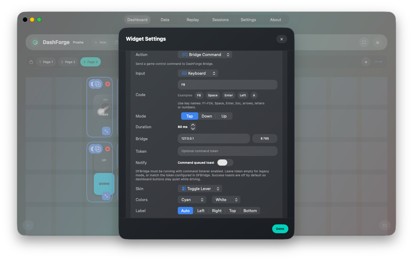
What Goes In Code
Examples:
| Goal | Type | Code |
|---|---|---|
| Press F8 | Keyboard | F8 |
| Press Ctrl+P | Keyboard | CTRL+P |
| Left click | Mouse | LeftButton |
| Right click | Mouse | RightButton |
| Send virtual-key F1 | Win32 | F1, 0x70, or 112 |
Gamepad command packets are accepted by the protocol for future compatibility, but DashForge Bridge does not currently emulate a virtual gamepad. For true gamepad behavior, use external USB HID hardware or a separate virtual controller driver layer.
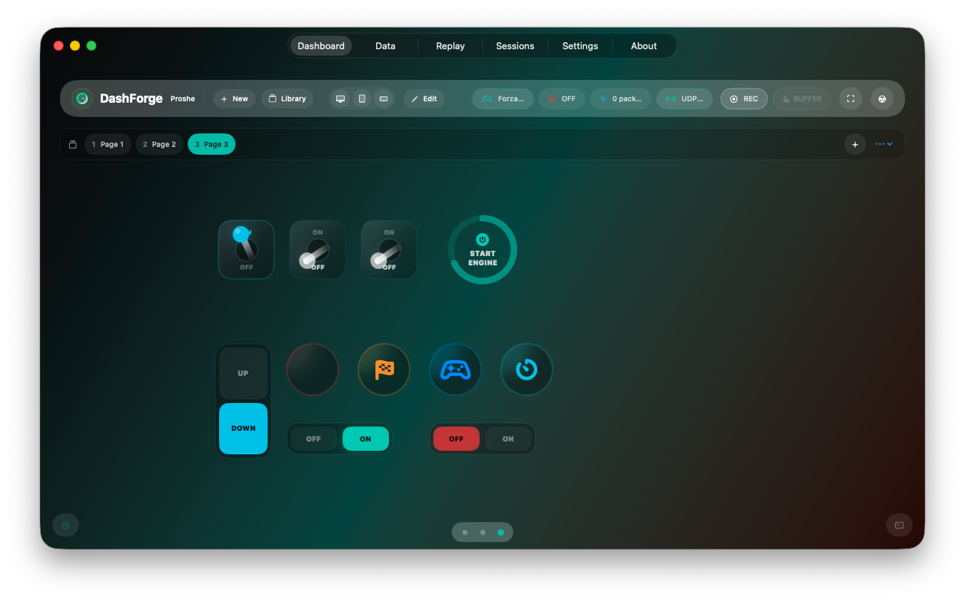
Button Box Skins
Action Button widgets can be styled like a small button box panel instead of a plain dashboard pill.
Open the widget settings and use Skin:
| Skin | Best for |
|---|---|
Capsule | Compact dashboard actions such as record, UDP, or quick commands. |
Push Button | Momentary controls such as flash, radio, camera, marker, or horn. |
On / Off | Toggle-like controls where you want clear ON and OFF states. |
Start Engine | Large start/ignition style buttons. |
Rocker | Up/down style controls, mode switches, or two-state cockpit toggles. |
Toggle Lever | A more realistic physical switch visual for button boxes. |
Use Active color and Idle color to match your cockpit theme. Common patterns:
| Use case | Suggested skin | Suggested colors |
|---|---|---|
| Ignition / start | Start Engine | Mint active, white idle |
| Pit limiter | On / Off | Mint active, red idle |
| Wipers / lights | Toggle Lever | Cyan active, white idle |
| Brake bias / menu up-down | Rocker | Cyan active, orange idle |
For Bridge commands, toggle-style skins keep a local visual state after each press. The Bridge does not report the real in-game state back to DashForge, so the switch position is visual only and can reset when the dashboard is reloaded.
Label Placement
The Label setting controls where the title/status appears relative to the button skin:
| Placement | Result |
|---|---|
Auto | Uses the default placement designed for the selected skin. |
Left | Label before the button. |
Right | Label after the button. |
Top | Label above the button. |
Bottom | Label below the button. |
Use Auto for existing dashboards and switch to a fixed placement when building
a grid of button-box controls.
For the full command reference, see Game Control and Hardware Overview.